11.05.2015
ifp website redesigned and optimised for mobile devices
To celebrate our 10th anniversary, we redesigned our website which we proudly present to you now. The update is not just limited to a fresh layout. It was just as important for us to also adapt the technology to match the demands of the smartphone era.
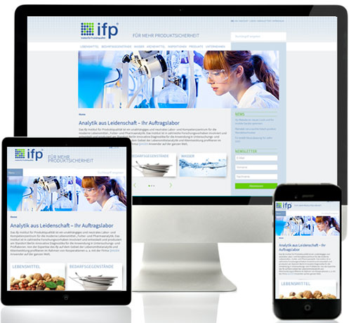 Our website is fully responsive from now on, meaning it automatically and flexibly adapts to the screen size of the device on which it is seen. Without cumbersome zooming, the usability on smartphones is now just as convenient as it is on a desktop monitor.
The quality of contents has not changed of course. In fact, a new category is available now: Under "Inspections" you will find detailed information involving our ISO 17020 accredited allergen and hygiene inspections.
We hope you are having as much fun surfing the site as we do, and we look forward to a continued and successful cooperation.